Workflow Engine

One of the most powerful features of Reach Engine is its workflow engine which enables scalability and customization for businesses. I was on a team dedicated to empowering workflow creators by developing solutions to increase authoring speed by 90%, improve seamless adoption, and decrease the amount of duct-taped technical code used in production.
There are a few large problems surrounding the workflow engine including: the workflow status page is hard to navigate and comprehend; there are large speed and processing issues impacting performance; and power users are missing functionality and high level analytics to utilize the engine’s full power.
I was on a team dedicated to empowering workflow creators by developing solutions to increase workflow authoring speed by 90%, decrease the barriers to entry, and decrease the amount of duct-taped technical code used in production.
Though one of the most powerful features of the Reach Engine products, it is often the first that gets reprioritized on the roadmap due to its complex nature. Workflow Engine is also by nature a backend, engineering heavy, power user tool; which made interpreting and simplifying deeper value adds more difficult than normal.
UX Liaison to the Workflow Development Team
I served as the UX representative on a squad of developers dedicated to solving these problems within the
Workflow Engine. I had to interpret extremely complex conversations had on this team to understand the value
add being brought to various stakeholders and how I could help ideate further improvements.
Conducting User Interviews and Persona Development
Outside of regular team interactions I worked closely with the Product Manager on the team to hold regular
customer interviews and user groups to discuss the state of the workflow engine. We used these sessions to
spark conversations around areas to investigate and problem solve further as well as prioritize roadmap items.
I also conducted interviews with users of the workflow engine in order to develop personas and gain
a deep understanding around their goals, KPIs, and problems they regularly face.
Product Manager for Workflow Status Redesign
As a result of user interviews and time spent working with the developers on the team, I ideated and prioritize features
to bring into the existing workflow status
page as well as the effort for the eventual redesign. From the feedback, I helped identify several
areas that reduced barriers to entry for new users and improved search experience and usability of the
feature.
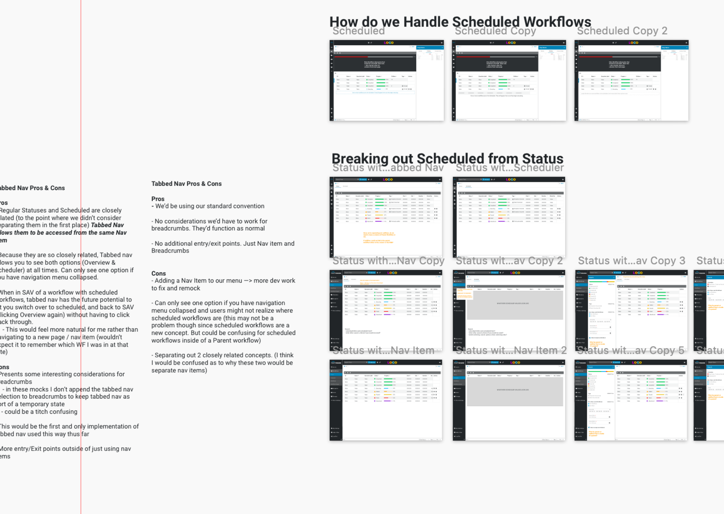
I additionaly spearheaded the development of an interactive prototype for the new Workflow Status Dashboard that we
then used to conduct usability tests to measure task completion rates and success metrics. We used
these tests to identify further areas of improvement before engineering started development.
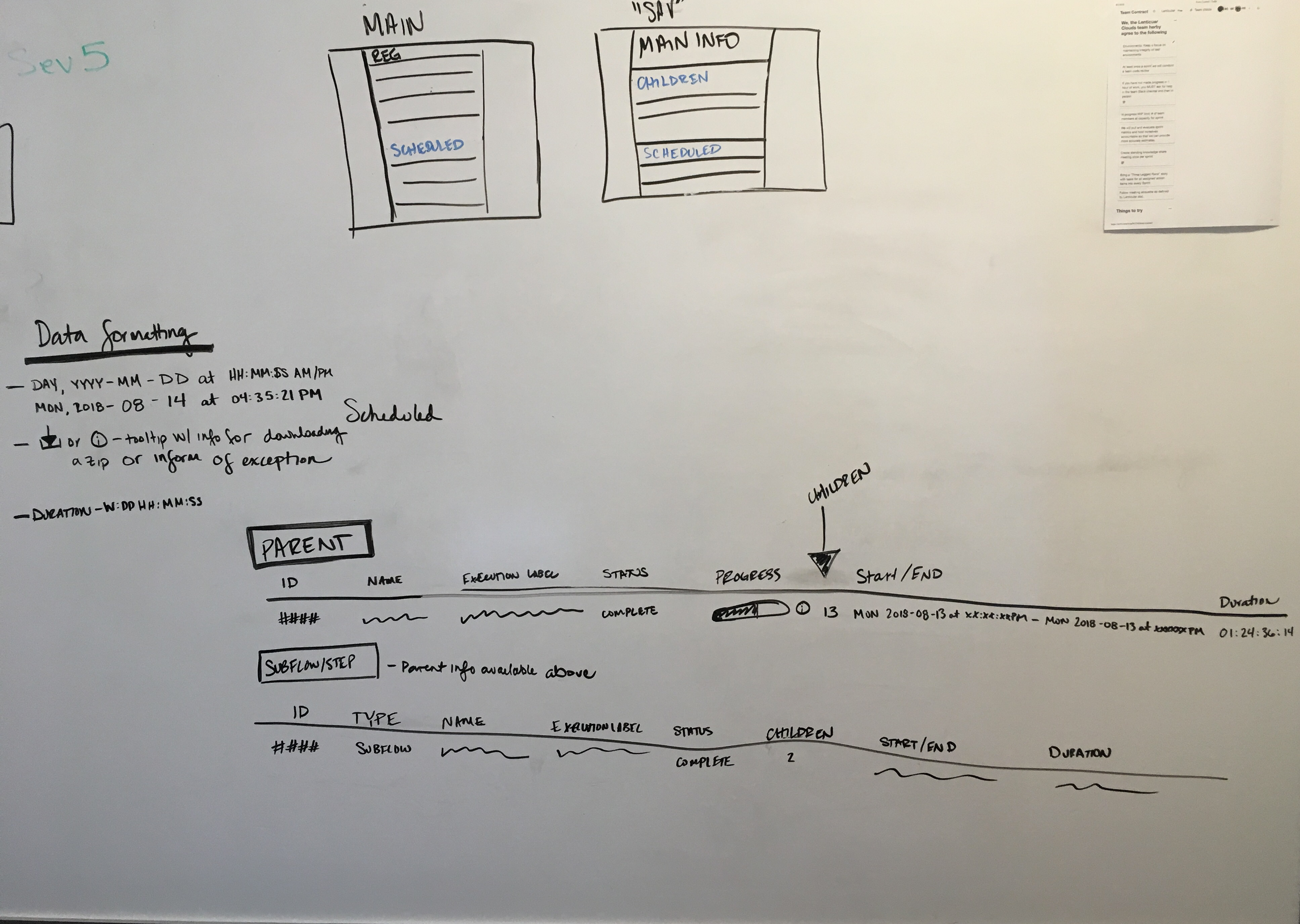
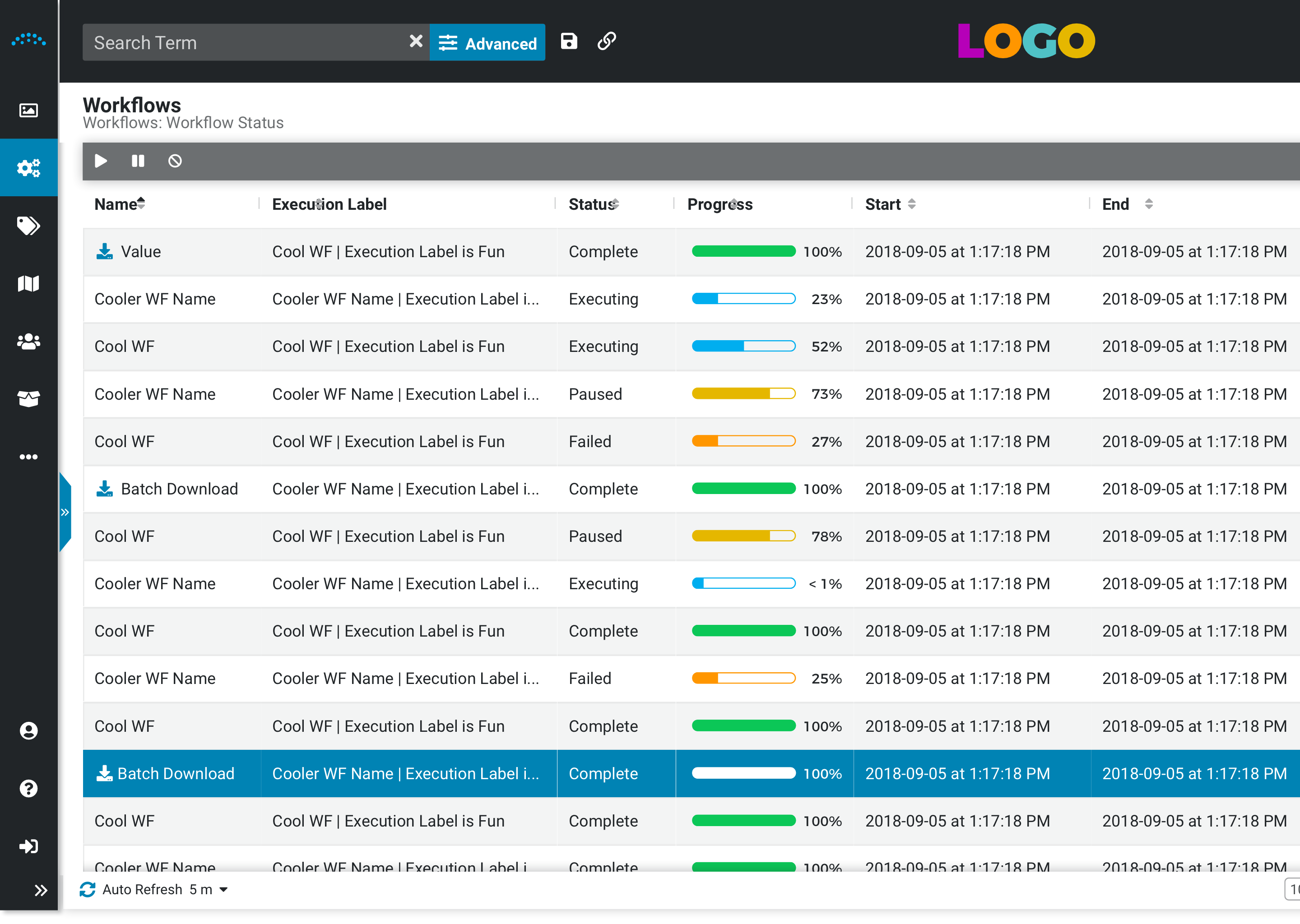
Enhanced Layout to clarify the navigation structure for parent and sub workflows
The current implementation of the status page had a three panel view that was extremely confusing to
understand what workflows were selected, what children were part of the parents, and what technical data
belonged where. I helped alleviate this by implementing a tree like structure to allow users to see parents
in one spot, with a quick glance at children in the sidebar without inundating them with so much information
at once.


Increased content capacity
By rearranging the layout, moving search to a more logical place, and decreasing component sizes we increased
the total amount of workflow content displayed in the dashboard. We previously had erroneous use of space that
created warped, small windows to view content in the old feature. This was especially painful for users on smaller
screen sizes such as an 11 inch Macbook Air or tablet.
Consolidated and improved search functionality
Features of search were scattered all over the place in the old dashboard. You could filter workflow types in
one area, select a checkbox in a totally different area something else, and pop open a modal for “advanced search”
functionality. For the redesign, we consolidated these concepts into a single sidebar and simplified arbitrarily
complex names being used.

New Technical Features
In addition to fixing some usability issues, I also helped drive new feature creation for technical users deep diving into
workflow structures in live production systems. Some of these features included:
- Surfacing Workflow Key on executions in the status page - This data point lets these users access the global workflow from the execution that was run in the system. Previously, they had to track down an ID, go to a completely separate page to find the ID, and then do a database look up to find the information they needed to troubleshoot issues.
- Context Data as JSON - When any workflow is run in our engine, there are attributes on the execution of that workflow--one of which is context data. This is essentially the information exchanged in the background of a workflow annotating certain events. Context data was previously only displayed in prettified key value pairs on the front end. We implemented a way to toggle between the prettified view and the raw JSON body with collapsable structures to make it easier for technical users to view and navigate nested structures.
- Direct Links to Errors- When workflows fail behind the scenes there are error messages that are surfaced on that particular step inside of the execution. Users had to dive through sometimes 5 or 6 subflows in order to get to the error so they could troubleshoot what was going on. We implemented a direct link to the errors from the parent workflow to avoid these unnecessary steps and save users time.