CBS Sports Golf App

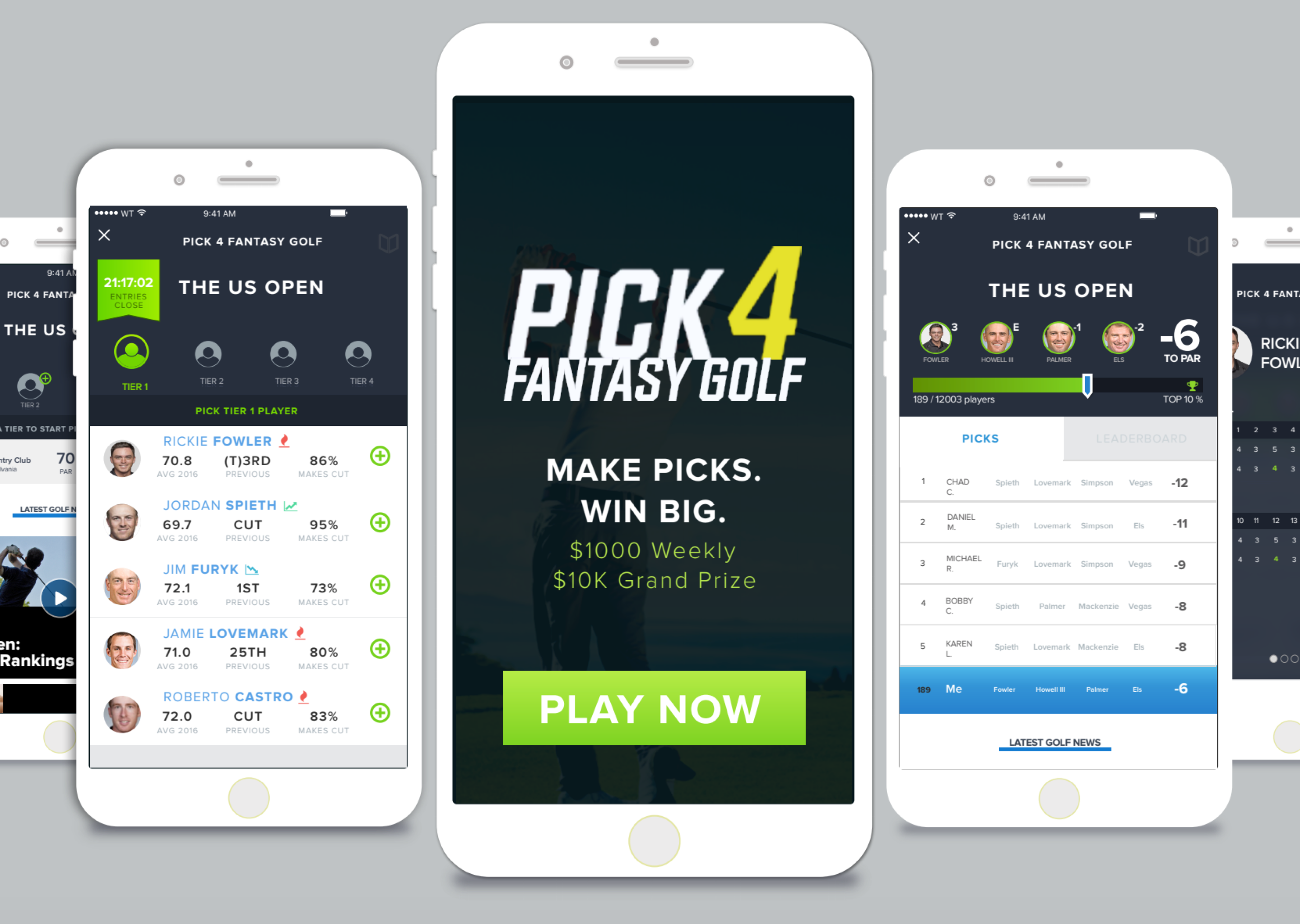
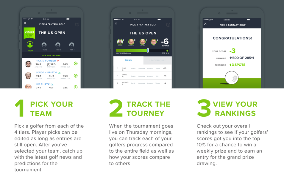
Pick 4 Fantasy Golf is CBS Sports golf centric answer to "pick games" that have flooded the sports gaming market. Users follow the real life golf tournaments throughout the year and pick four players for the week that they think will perform the best. Picks are ranked weekly and the players with the top picks are eligible to win a $1000 weekly prize and an entry into the drawing for the end of year $10,000 prize.


I was in charge of beginning the revamp of CBS Sports' existing Pick 4
Fantasy Golf App. This included doing an extensive analysis of the existing application--it's goals, current functions,
and opportunities for improvement, research on competitor pick games, identifying user paths and goals, and aligning
our core business goals with a delightful, new pick game experience.
I worked with a full-time Product Designer to flesh out user paths/goals, sketches, wireframes and prototypes, as
well as iterating on feedback from the Product Director to ensure that we were creating a holistic user experience
while aligning with our overall Fantasy Sports goals.
Analysis of Existing App
As a new intern, unfamiliar with the Pick 4 Application, I decided to do an extensive audit of the existing
app to familiarize myself with the layout, interactions, and my feelings as I navigated the app. I documented
my experiences and outlined SWOT areas (strengths, weaknesses, opportunities, and threats) to obtain some
qualitative insights on the app for reporting back into the Director. I presented these findings and insights
to my partner and my director to then begin strategizing our approach for the redesign.
Identifying and Aligning Goals
To power our planning strategy, Jon and I met to discuss and flesh out personas of who our target market and users
are, their needs, driving CBS Sports' business metrics and overall app downloads to those needs, and brainstorming
how we can develop monetization opportunities on the app without sacrificing usability. I targeted key individuals
in the CBS Sports office, such as the VP of Fantasy Sports, Project managers, and Marketing VPs to gain a solid
understanding of our business motivations for the project. Jon reached out to potential users and spoke with them
about their experiences. From there, we then shaped our bases into casual fans, golf fanatics, gambling gurus to
address the needs to shape the content and direction in moving forward with the Pick 4 Redesign.
Casual Fan
Casual fans play these games intermittently and may know a few big-name golfers in the game. These also represent
the users that offer the potentiality for developing into avid users of the game and thus a key target to make sure
we hook.
Golf Fantatics
Golf fanatics know the ins and outs of the game and offer better statistical analysis in the inner workings of
their minds, than the stats that are currently given. We needed to keep this core user base by engaging them and
entice them into coming back with bonus CBS Golf Content.
Avid Gamblers
The gamblers represent the thrill of the game. We determined we need to make this game easy to onboard, get the stats
and analysis needed to make top picks, and gamification to entertain them in down periods.
Developing Experience Strategy
After identifying our key users and speaking with users out in the field, we moved forward into the
framework end of determining user flows through a potential app, how we'd meet goals at each section,
and sketching out our initial thought process. To ensure our process was business and consumer-centric,
we laid out the overarching goals of the stakeholders and constantly assessed how we approached them.
Jon and I worked separately to create different layouts and flows to get a feel for a range of possible
solutions to the application and reconvened to observe similarities, differences and opportunities to
merge the best of our brains.
Iterative Design
The iterative process is extremely important process. We sketched and wireframed and constantly received
critical feedback to hone our creations in order to address any issues that came up. The goal was to start
small and get an MVP (minimum viable product) to iterate upon to get to the next stage. We started off with
general layout and where things might appear on the page and gradually increased the fidelity of our designs
through separate stages of access within the app.
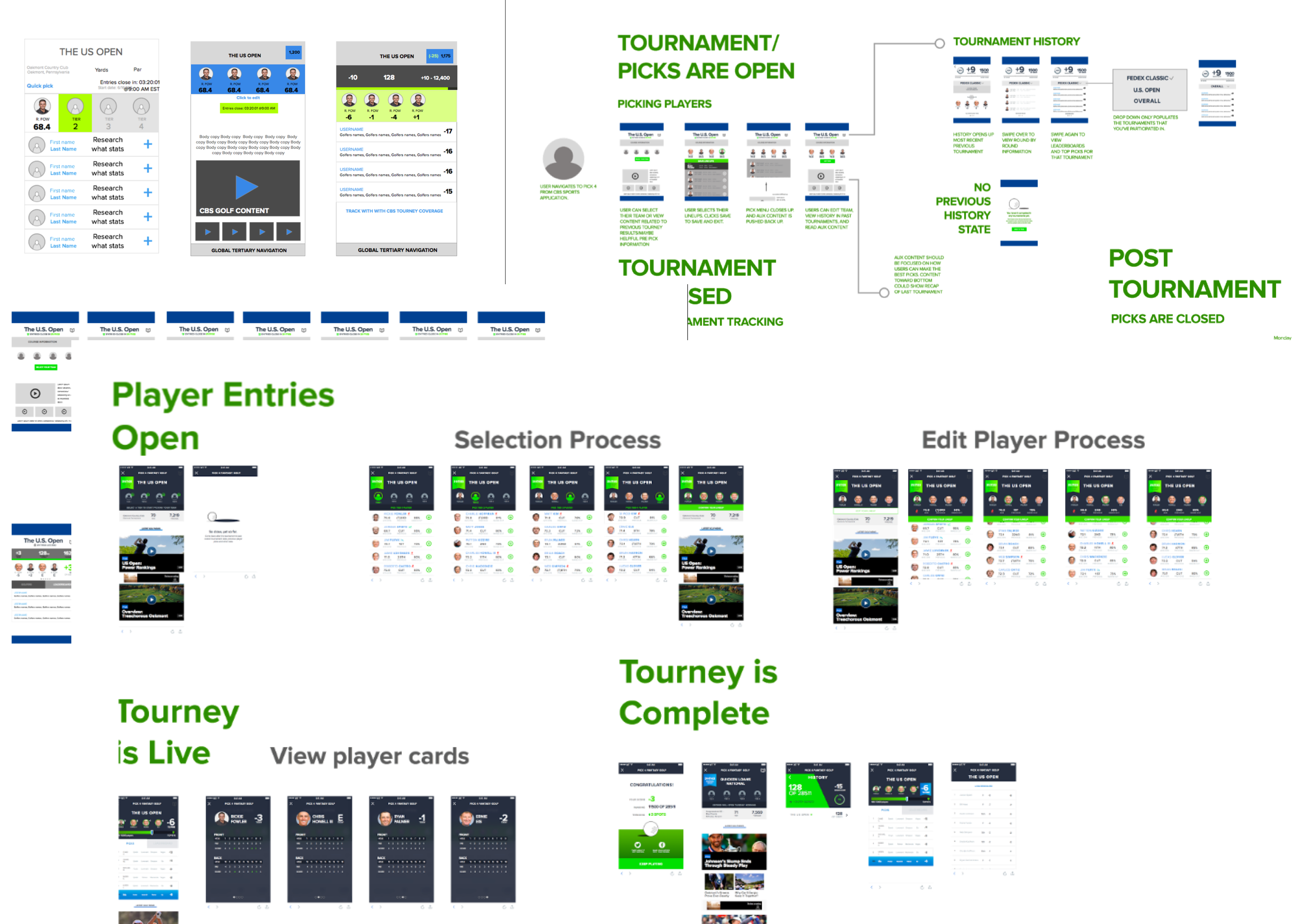
The final wireframe lines out the 3 major stages that users interact with the Pick 4 application: Tourney is Open,
Tourney is Live, Tourney is closed. Based on the strict logic for selecting golfers (and not being able to change
them after the fact), we were confined to these 3 stages that segment off usage during the week. For example, if
you pick your lineup when it first opens, there was nothing in the original app that brought you back without prompting.
Thus, engagement and retention were greatly affected by this dead-zone of zero forward motion activity.
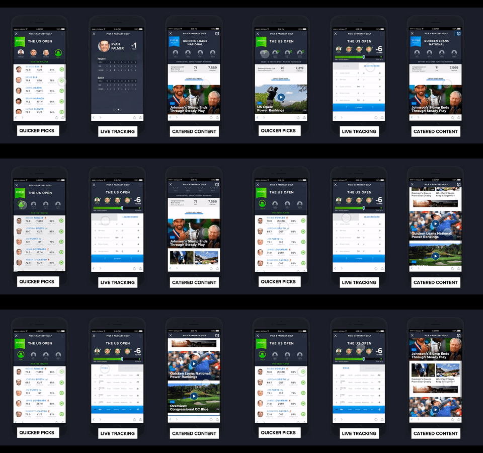
We combatted this by integrating CBS Sports golf content via videos and articles. This addresses lulling engagement
periods after these key stages and also adds a layer of monetization through pre/post roll advertisements.
Prototyping and Results
Invision really allowed us to bring our ideas to life and to show a clear flow that users would take through
our app. I was in charge of prepping all of the files for transfer to Invision, as well as developing the
prototype in full. In our first go-around, the prototype created felt a little stilted as far the seamlessness
of interactions and flows through the different stages of Pick 4. Products and design are never perfect and
thus it was back to the iterative board.


The Pick Process and the Live Tracking stages faced the most scrutiny in terms of clunkiness and ease of use
and navigation. We tweaked the Pick Process to ensure that users could pick and edit their players in a
friendly modal that feels less like you're being taken to a different stage of the app. Live Tracking faced
issues in how progress and our added gamification was being displayed. Our progress hub at the top was trying
to be too kitschy and ultimately we scaled back on the grandeur we had initially planned. I developed and
conducted user tests to gather feedback from the prototype and to drive further decision-making.
Upon completion of the prototyping process, I compiled all of
the Pick 4 documents and assets as well as the prototype itself to present to the Head of Product, the VP of
Product, and various other CBS employees for an internship showcase at the end of the summer. It was met
with positive feedback, particularly in regards to addressing the means by which to monetize this previously
unmonetized application and promoting more CBS Sports content without detriment to the overall interface.
This, however, is still not a final solution as summers only last so long; and was meant to demonstrate
the importance of in-house design, development and research when it is feasible to do so.
There is always a hierarchy of
needs that underlay any project and they often conflict with each other. I honed the process by which I define
stakeholder needs and constantly hold those as the standard for which drives the design. My mentor helped me greatly
improve my Big Picture Thinking as opposed to jumping in the big pool of design. He engrained it
into my head to think about processes, flows, and the overall needs and goals of users to craft wonderful experiences.
Design doesn't inherently make great UX, but rather research, user tests, flows, and overall stakeholder goals to
ultimately shape the experience.