CS Mott's DriveSmart

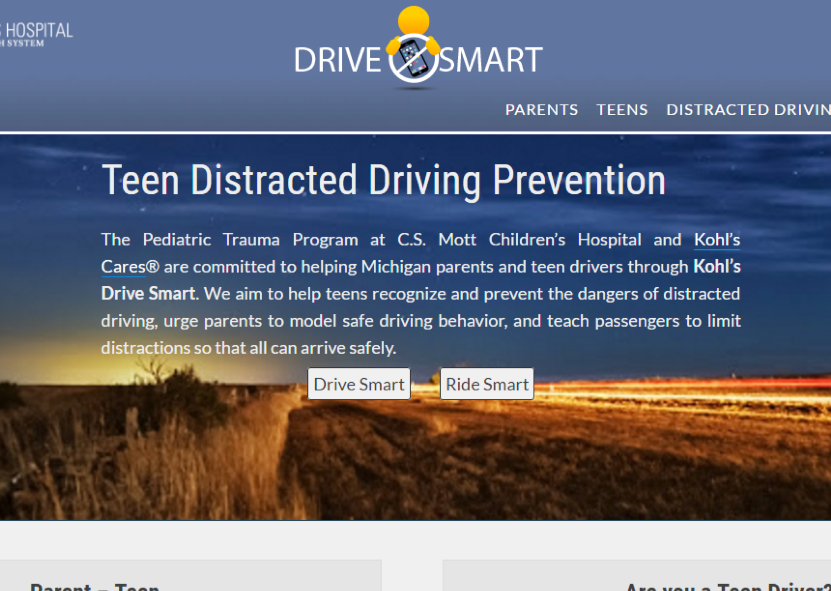
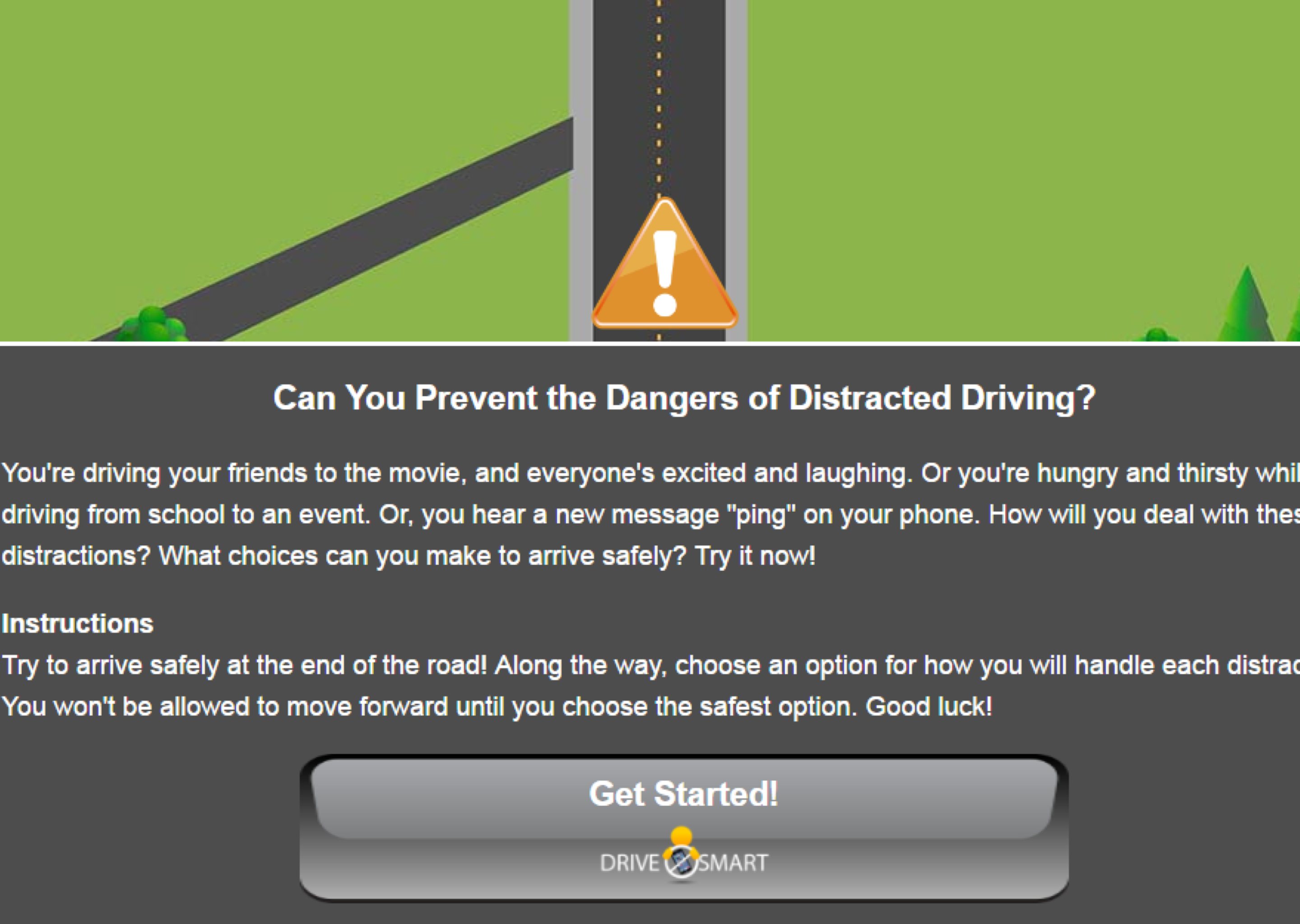
C.S Mott's DriveSmart program is a partnership with Kohl's to combat teenage distracted driving through preventative measures. The program is targeted primarily at teens and helping them to recognize and prevent distracted driving, but also focuses on parent education and urging them to model safe driving behaviors to their children. It features educational materials, safe driving packets, an educational game for teens to practice safe driving situations, and a contract for teens to pledge to drive safely. This project is a complete user experience analysis conducted for DriveSmart.
I worked as a UX Researcher on the DriveSmart program with a team of 4 graduate students through the University of Michigan graduate course, Usability Needs and Evaluation. We were approached by C.S Mott's Children's hospital to tackle key problem areas for the DriveSmart website and interactive driving game and to conduct a full user experience analysis to determine its existing effectiveness and where to move forward as far as improvements. To do this we conducted interviews with members of DriveSmart's user base, developed personas, conducted a comparative analysis on DriveSmart and it's competitors, created a survey to gather initial data and feedback from users, formulated a heuristic evaluation, and finally conducted usability testing.
Initial Meetings with DriveSmart
We began our venture into this project by meeting with the clients at DriveSmart to orient ourselves to the
problem. We formulated a list of questions to think about when moving forward to the beginning interview process:
How do people define distracted driving? How do people think of cellphones within the context of
driving/safety/distracted driving? Is there a need for an app focused on distracted driving? Should a program
consist of various methods (mobile, web, cross platform) to engage its users? When should children be taught
about distracted driving (what age?)? What are people’s thoughts and opinions about teenage driving? How do
adults view teenage driving? How do teens themselves view their status as drivers?
A deeper understanding of an individual’s own definitions of distracted driving, how parents and teens
choose to address and engage in safe driving habits were key to helping DriveSmart develop its program
further. We determined that we needed to define more concrete needs and goals of parents and teenagers by addressing
the above questions, interview real users of the system, and conduct usability testing to aide DriveSmart’s
capability to engage everyone in a safe driving experience.
Interviews and Personas
As Aaron Levie says, "You'll learn more in a day of talking to customers than a week of brainstorming,
a month of watching competitors, or a year of market research." That being said, one of the most important
parts of my business and UX strategies are getting out and talking to the real or potential users of any product.
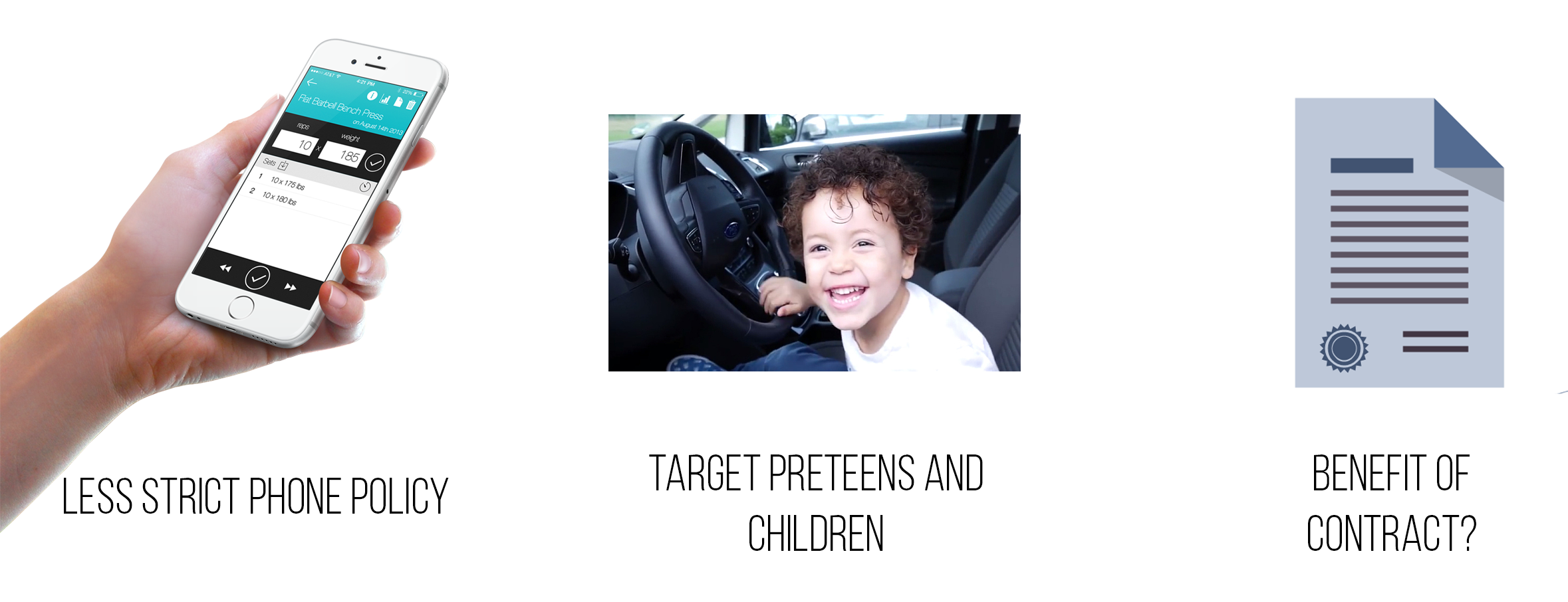
For DriveSmart, while it initially seemed like teens would be in our user base because of the interactive game,
we decided to narrow our scope to focus solely on the parents themselves on the basis that a majority of the
content is targeted towards parents beginning the discussion on safe driving. Thus we reached out to individuals
who were part of our target market of parents with teen or preteenaged children with various backgrounds,
ethnicities, and family makeup.
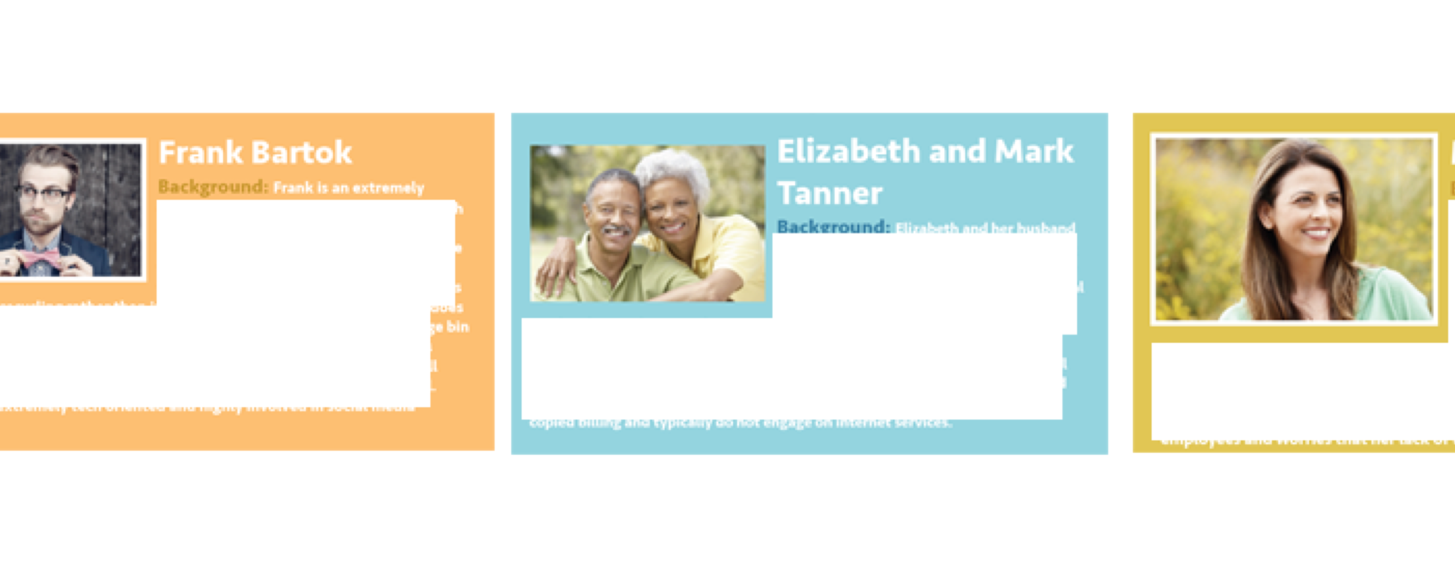
After conducting our interviews and summarizing our initial findings and recommendations, we developed
key personas to keep in mind through the successive steps of our overall usability analysis. From our
interviewees, we took various characteristics, concerns, and backgrounds and developed 3 key personas
that outlined various types of parents with an array of experiences. I had prior experience in fleshing
out interviews and developing resulting personas so I took the lead on extracting the data from our
interviews, interpreting it and helping to shape these potential users.
Comparative Analysis
After getting a clear understanding of our users concerns, feelings, and thoughts we switched over to
focus more on DriveSmart as it exists currently and where it ranks compared to other safe driving applications and
programs. Conducting a comparative analysis helped us to identify DriveSmart’s potential competition; get a sense
of what users might expect when they engage with DriveSmart; outline a framework of best practices with regards
to this type of app; consider possible solutions for challenges users currently face when using DriveSmart;
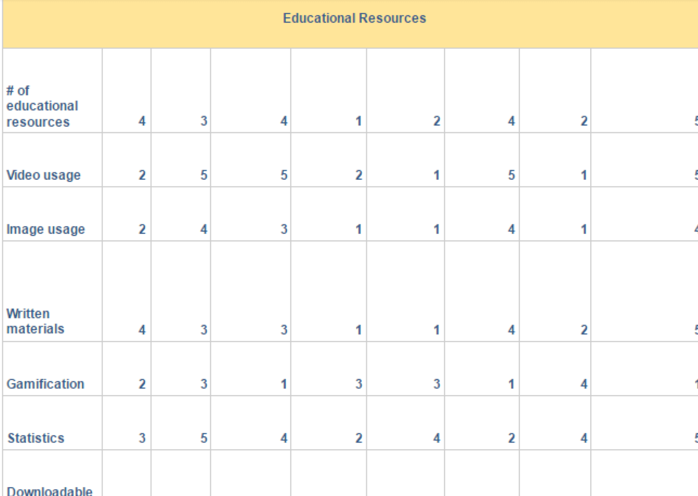
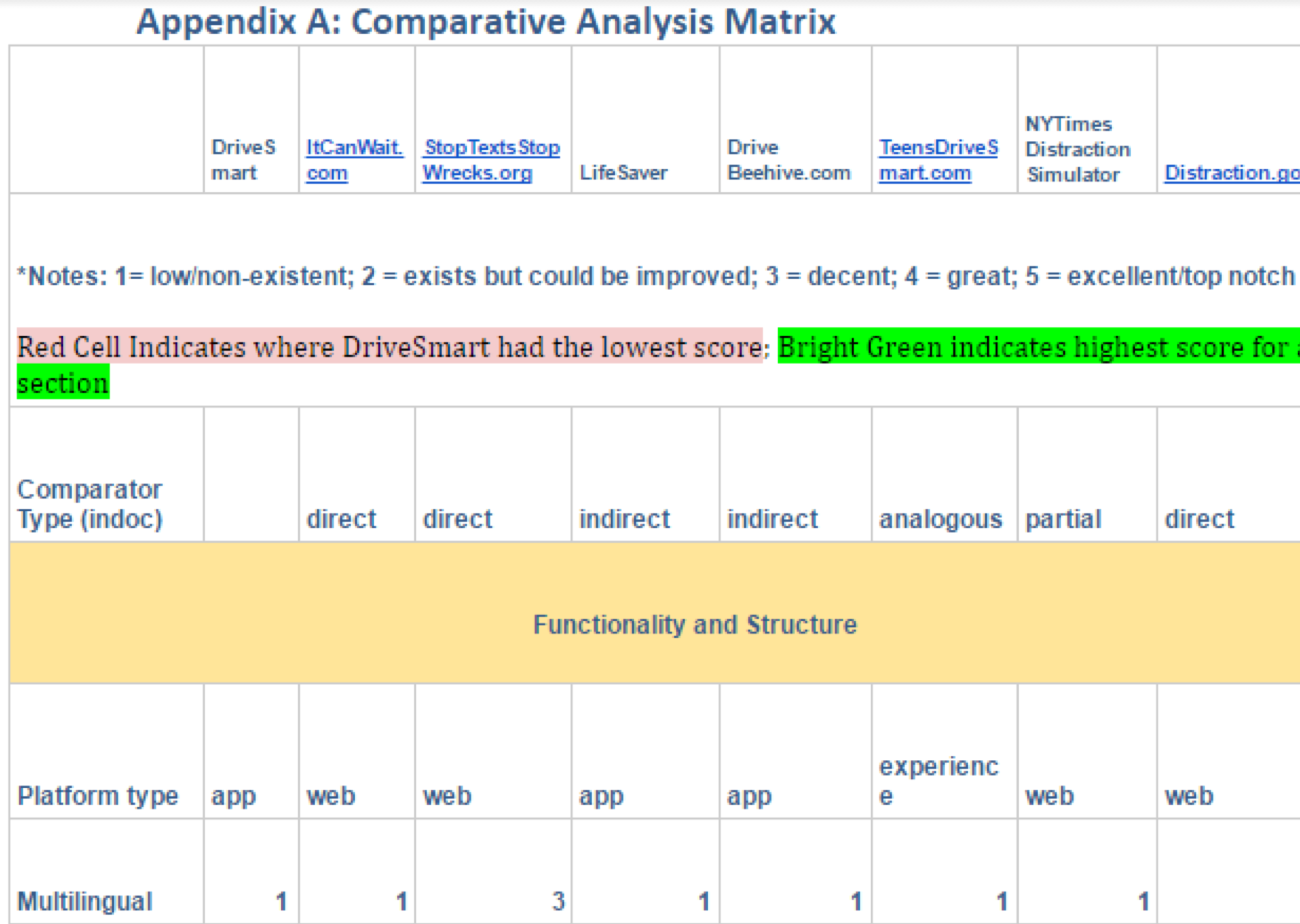
and present potential ideas that could be included in future versions of the DriveSmart app. We researched
7 competitors: ItCanWait, StopTextsStopWrecks, LifeSaver, Drive Beehive, TeenDriveSmart, Distraction.gov,
and the NYTimes Distraction simulator. We researched each of these competitors in depth and profiled them against
DriveSmart using a Competitor Feature Evaluation Matrix with clusters of features focused on different aspects
of the apps and websites as points of comparison and evaluation. This methodology helped illuminate DriveSmart’s
strengths and weaknesses.
Survey
We developed a twenty-two question survey to gather key insights and sentiments from DriveSmart’s target population.
Because of the lack of data on DriveSmart’s target users, we designed our survey to answer the following overarching
questions: 1) How do parents use and see mobile devices in their daily life? 2) How do parents think of and deal
with safe driving issues regarding their children? 3)How do parents value different types of educational resources
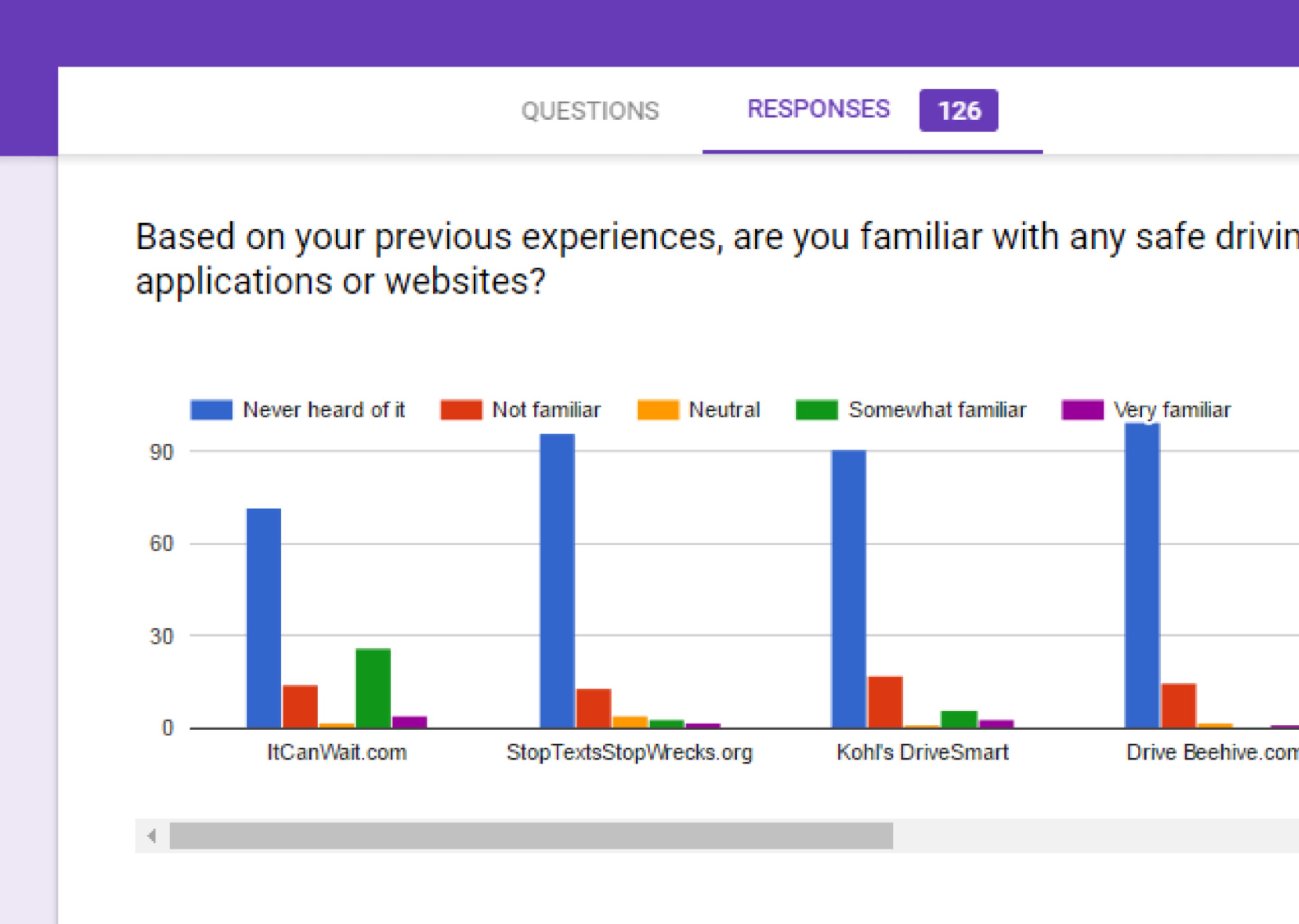
on their mobile devices? Our survey garnered 112 responses in total, and the survey revealed that parents are
teaching safe driving habits at a young age and are very concerned about distracted driving. However, parents
often engage in unsafe driving habits despite this concern. Pledges—a main feature in DriveSmart—are under
utilized and not considered useful, while videos are considered highly useful for education. Overall we found that
parents are not familiar with distracted driving applications and websites.
Heuristic Evaluation
Heuristic evaluations use Jacob Nielsen's 10 heuristics to allow usability and functionality to be measured
with severity rankings and can aide in the improvement of the design and user-friendliness of a website
particularly catered toward the target audience. We each conducted individual heuristic analyses. I laid out a
table for each section of the site including a description of the issue, a severity rating, and which heuristic
it violated. We then reconvened to discuss all of our results together and combine our severity ratings to
get a sense of how severe things were across evaluators.
Overall, we found that for DriveSmart to improve its usability, we recommend that our clients: Improve the
navigation cues by freezing the upper navigation bar on each page and adding breadcrumbs. Use graphic design
to present statistics and information in a more engaging manner. Make it easier for users to navigate to and
from the DriveSmart distracted driving simulator Make sure your site is accessible to people who are hearing
impaired and color blind. Keep formatting consistent throughout the site and eliminate redundancies. Improve
error prevention and error recovery. Make DriveSmart for responsiveness across multiple devices.
Usability Testing
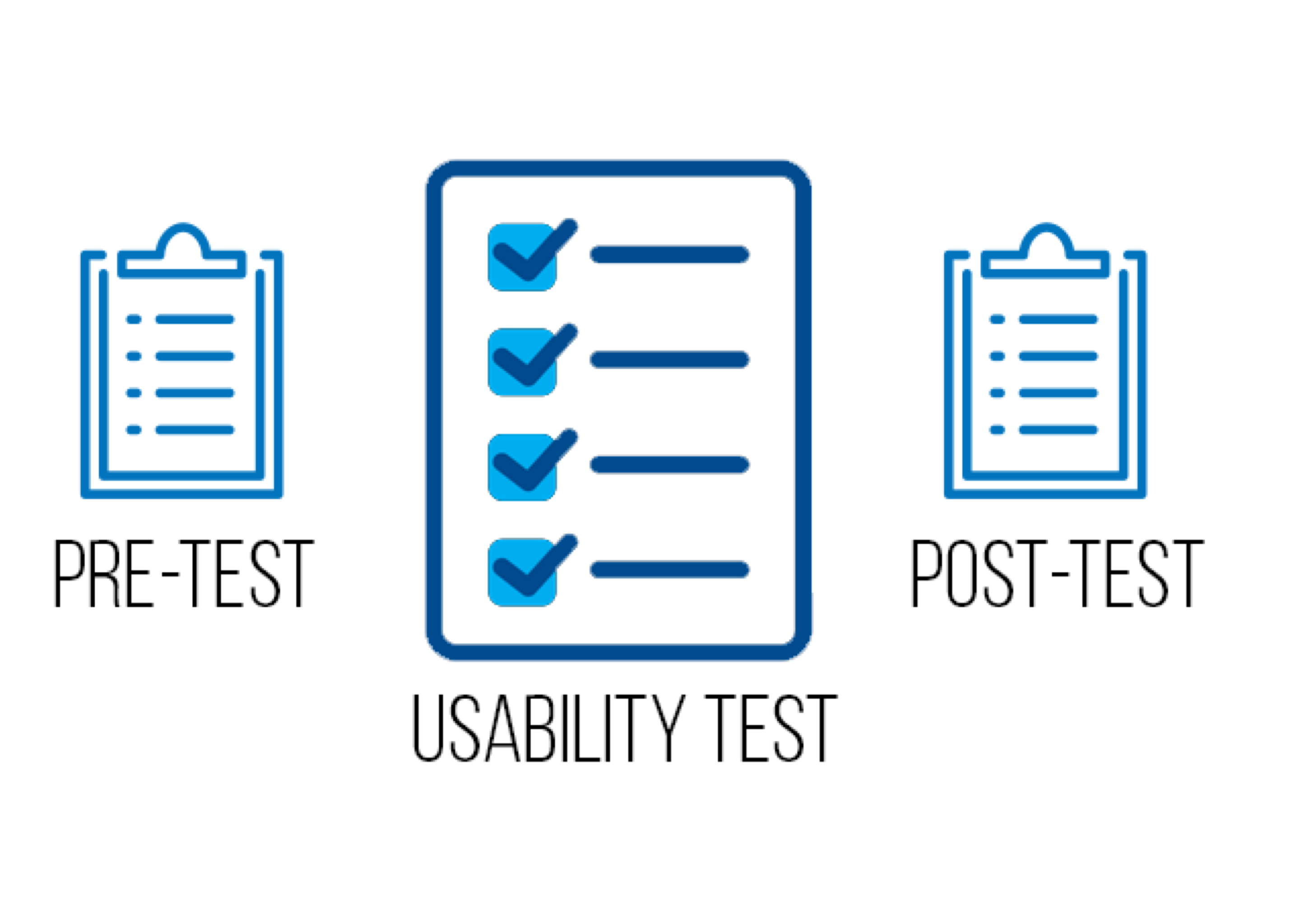
At long last, we finally reached the step of conducting usability tests. We set up pre and post test
questionnaires and the tasks for the test itself for users to attempt as they use the current DriveSmart
interface. We captured their interactions using screen capture technology as well as recorded audio to log
the process to reduce errors in recalling any information or data from memory. I served as the moderator for two
of the five usability tests we conducted and logged notes for two other tests. As a moderator, I led the users
through the usability test and pre and post test. I made sure to make the user comfortable to give feedback
on their experiences and explained that we were testing the website and not their own capabilities.
I additionally made sure to only serve as a guide and to provide as objective instructions and feedback as
to not bias any decisions the users were to make.
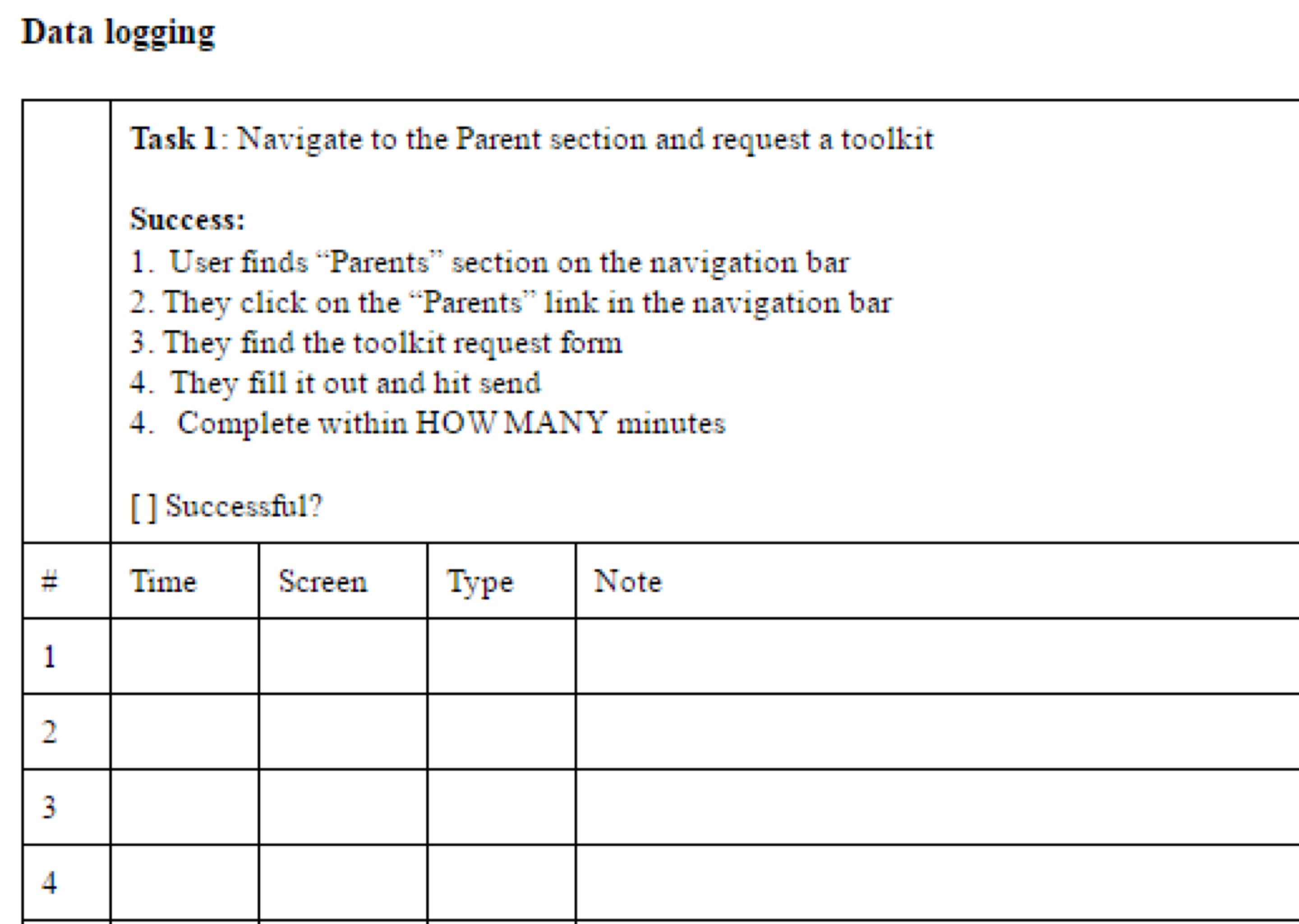
We framed our test around the following key questions: What features within the website are confusing/frustrating
for users? How easily can users locate the resources they need? Do users find the resources on the DriveSmart
website to be useful? Are the navigation, aesthetic, error prevention, and recovery issues we found in our
previous reports also problems for DriveSmart’s target users? Do users demonstrate specific patterns and
preference as they look for information? From these questions we were able to identify key tasks for the
users to complete on DriveSmart, how long the tasks should take, the criterion for success or failure for those
tasks, and logging sheets to record this data.
Once we concluded our testing, we met to compare all of the data we had collected and began the interpretation process.
We found that users specifically struggled in navigating DriveSmart, did not have the desire to view the long
videos provided despite having favorable opinions of video in general, could not easily find statistics on
distracted driving, and were confused by certain terminologies. We recommended that they address these key issues
to improve usability by employing more systematic navigation cues, emphasize important facts and statistics with
graphic design, focus on shorter more accessible video, and clarify confusing, scientific terminologies.
This was a valuable learning process where my team and I worked with real clients to provide deep insights into the
inner workings of an interface. Each step in our process was documented thoroughly and we produced 5, 30 page
research papers with the purpose, methodology, findings and recommendations for our clients to then take
action against. The DriveSmart project has a lot of potential in making a difference in the lives of teenage
drivers and additionally has university backing and funds to move forward.