Spartan

Spartan is the endearing code-name given to the redesign of Reach Engine Access — an enterprise media orchestration platform that powers some of the world’s largest media companies and workflows. Access was built on years of tech-debt and was wrought with inconsistent features and components that made the experience confusing and tanked development time.
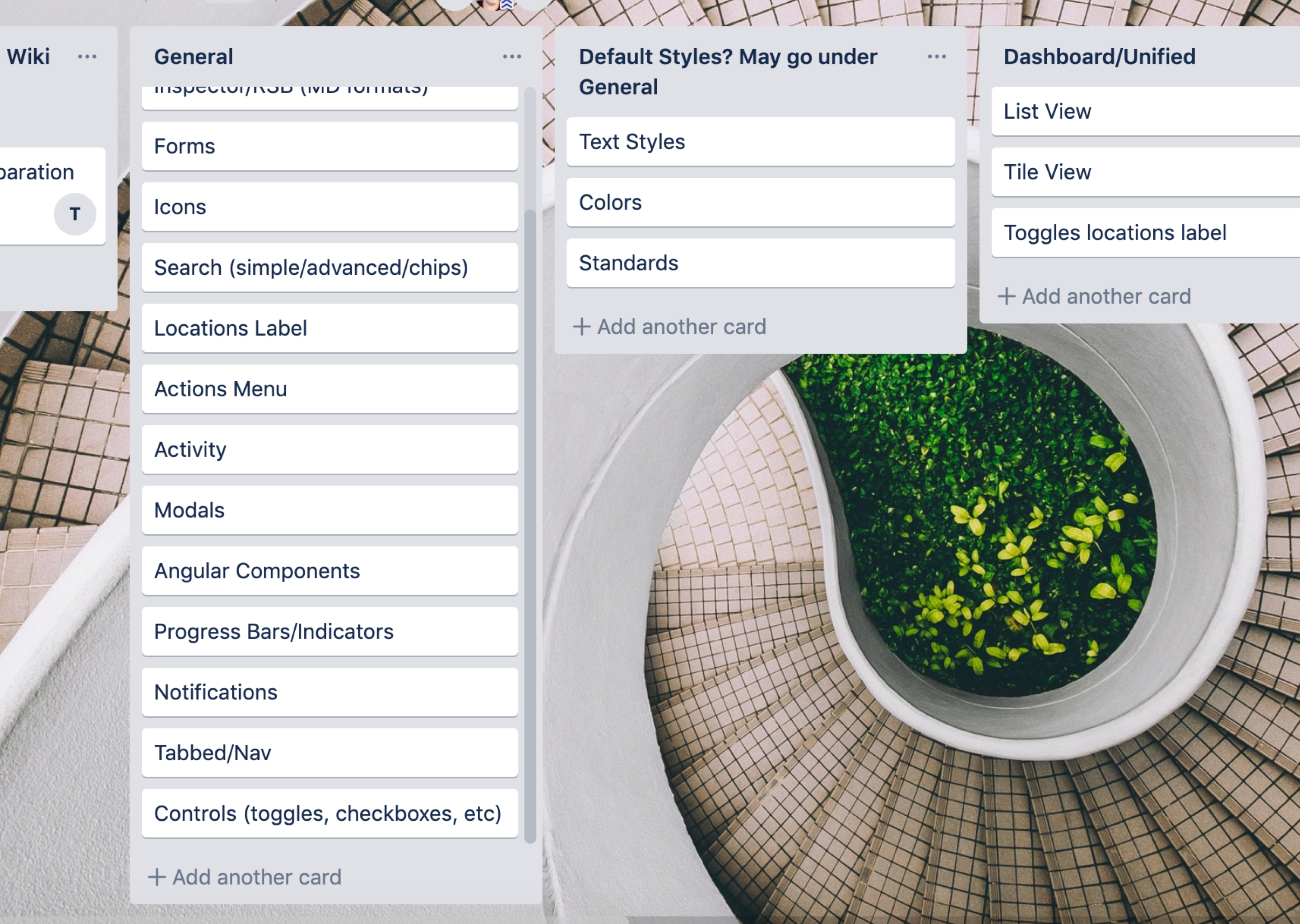
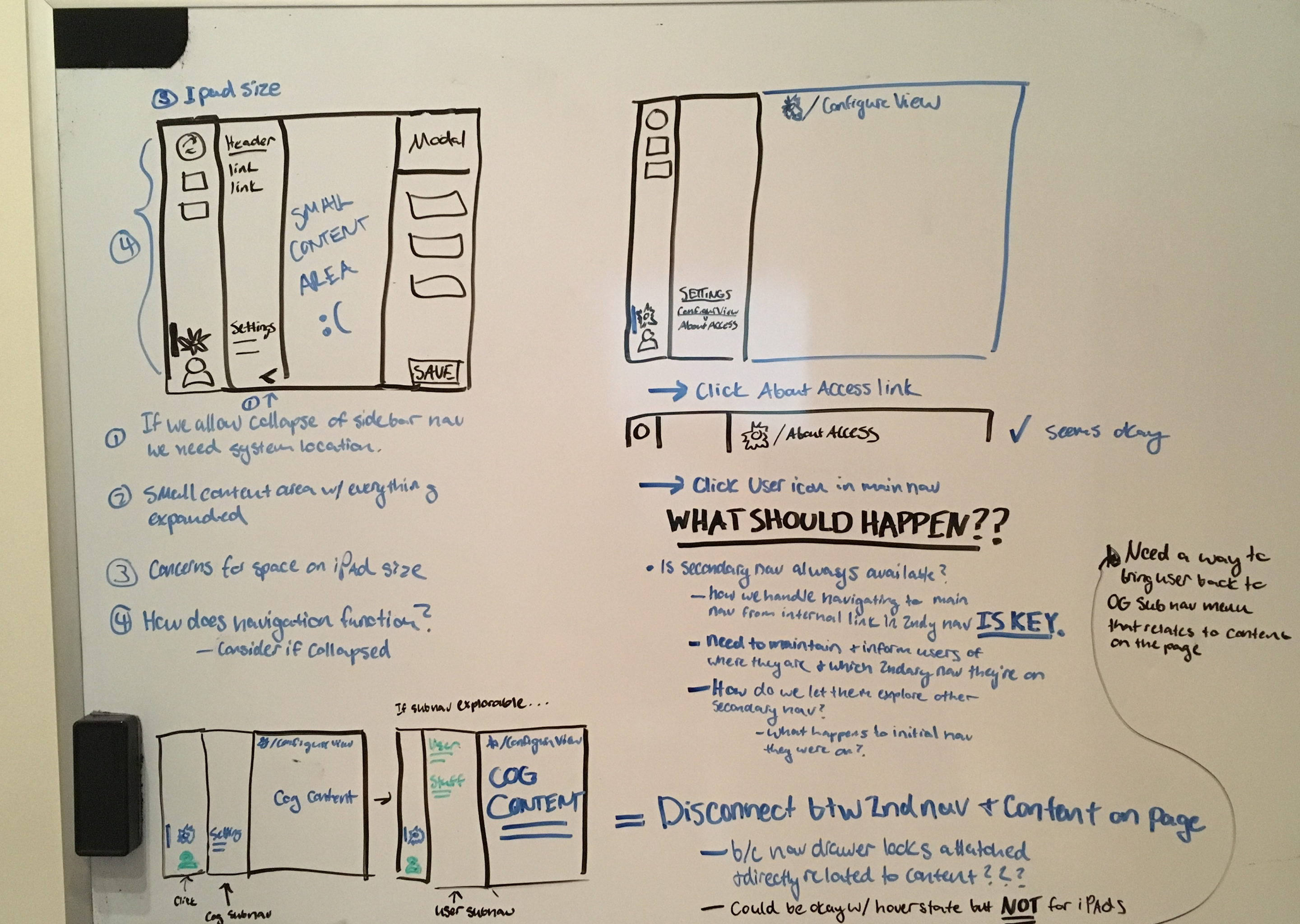
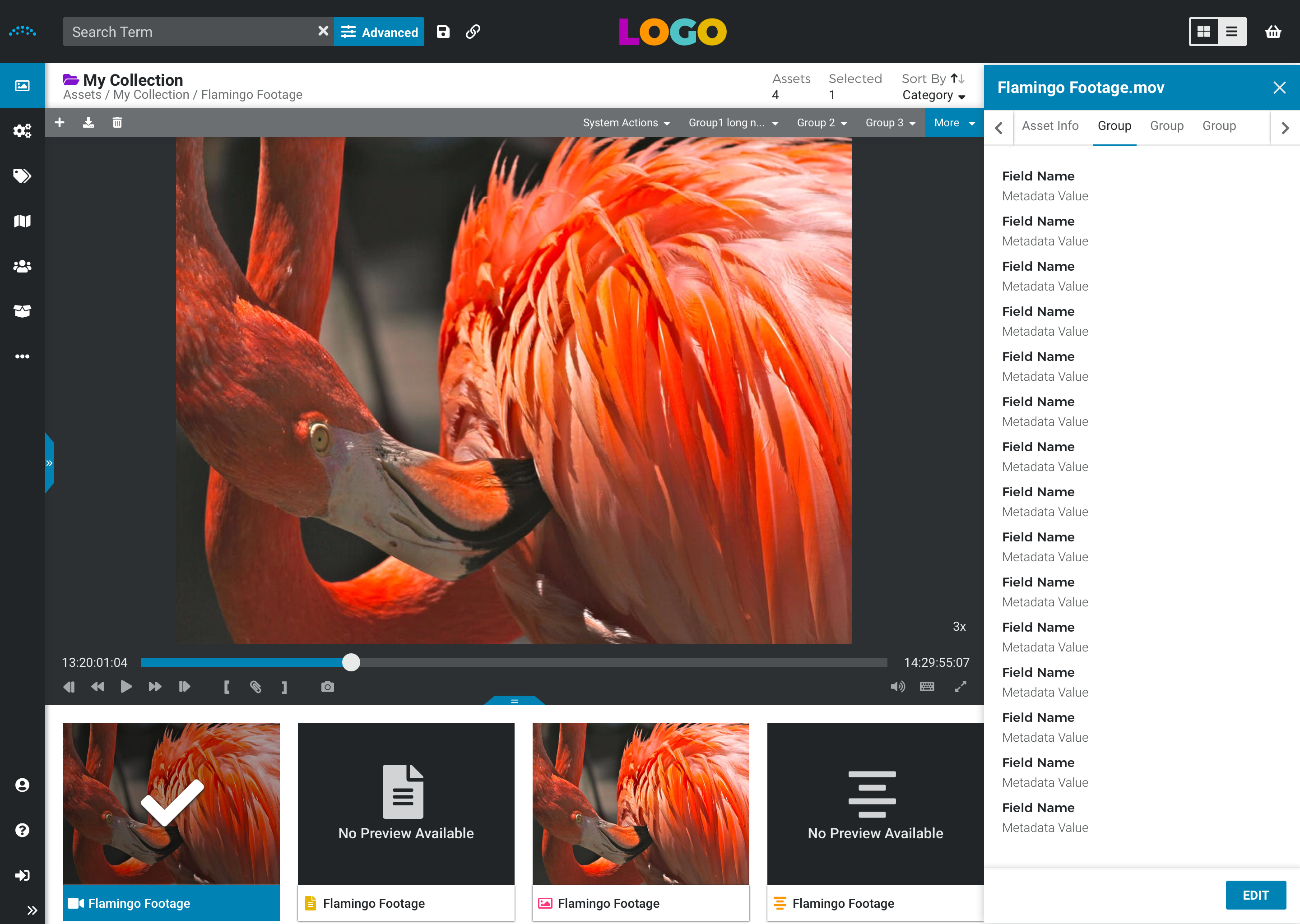
Prior to the Spartan effort, the Reach Engine platform was rife with inconsistencies with its interactions, styles, design componentry, and overall experience as an application. For existing users, it was usable but primarily through tribal knowledge and confusing work-arounds. Through spartan, we used data-driven research to not only update the UI, but to identify confusing pain points and optimize features that allow users to accomplish their goals faster. For enterprise clients, less time spent on tasks equates to less money spent in their production lifecycle.
Stakeholders that benefit from Spartan include both internal and external users. End users of Reach Engine vary from asset and content managers, to editors, librarians, producers, and executives. Internally, this benefits our software and quality assurance engineers by reducing the overall development and testing cycles.
I was on a User Experience team of three tasked with this redesign.
My Responsibilities
- Interview sessions with clients
- Organizing feedback through affinity diagramming
- Researching design trends and Brainstorming concepts
- Conducting usability tests to help determine design decisions
- Implementing and maintaining a unified design system in Sketch
- Assisting product in prioritizing work on the roadmap
- Warm handoffs with developers working on the features
I worked closely with my lead for aligning our team with my design concepts, as well as tag-teaming research sessions; Product Managers for prioritizing the roadmap; and developers for gaining alignment on design requirements and functionality.
Spartan’s initial scope was slated to be around 8 months to a year to research, design, and develop.
Due to shifting company priorities affecting product roadmap, development crossed over several months
and sprints and many features’ full implementation had to be modified from the most desirable experience.
Another looming problem for the redesign was the number of clients on previous versions of software that
had yet to be end-of-lifed. For a significant period of time, we had to maintain stories and fixes for
previous versions and the Spartan.
Existing Application Analysis
One of the first things I did was analyze and document pain points and confusing areas in the existing application.
As a new employee at the onset of this project, I was a perfect person to immediately identify gaps in logic
and design. Through my analysis, I created an organized backlog of usability enhancements for our UX team to
consider and prioritize when designing components for Spartan.
Through this backlog and user research conducted with existing clients, we were able to parse out areas to
divide, conquer, and return results back to each other as a team.
User Interviews and Research
Designing without data and research is just art. I helped extensively interview enterprise clients on what pain
points they had with the application, use-cases for various needs across industries, and translate this feedback
into actionable areas for our team to investigate.
Implementing a Design System
While already using basic sketch workflows, I realized we needed a unified area to access finished components
and apply them to features we were designing. This resulted in our first design system of responsive sketch symbols
that allowed us to spend less time focusing on minute details and more time on broader functionality and interaction
requirements. I also researched methods for how to best translate our designs over to other stakeholders and helped
integrate Invision to our UX, engineering, and product workflow.
To round out our design system and ensure our concepts were translated correctly with devs, we also implemented 2
new tools to our process:
Abstract - a versioning tool similar to a Github for Design that allowed us to work in the same files and
manage any exceptions that occur if any of our team had overlap on work.
Invision - a prototyping tool that has a super handy inspect mode for developers to access styles
as well as the correct flow for any feature. This was a huge win in our process as we previously had to hand-write all CSS styles into Jira tickets
Usability Testing
Another portion of work I took ownership over was conducting rapid usability tests for our design concepts.
As a startup, we have to move nimbly and make smart decisions to boot. These small tests helped us evaluate our
design choices and quickly get feedback. If external end-users were not available we tested internal users in as
an objective environment as possible
Some of the awesome things we achieved through the Spartan redesign effort.
Consistent Design
- A modal, sidebar, or any component in one place will have the same look and feel anywhere in the app
- Reduced overall color palette and outlined usages for each
- Eliminated erroneous steps and flows that broke conventions and expectations
Vastly improved components
- Button states that were previously non-existent: active, hover, disabled, confirming
- We eliminated the modal hell Access was in by utilizing sidebars. This allowed users to multi-task data entry and browsing without interruption
- Drag and Drop was a hot mess before we got our hands on it. We improved task-completion time by nearly 30 seconds, by creating a single, reorderable picklist component.
Sensible Navigation
- Everything was thrown haphazardly into an admin screen, we fixed that.
- Organized features categorically in navigation to increase search-ability and exposure
- Ensured the navigation menu was accessible with text descriptions for new users while implementing a collapsed version for power users to see more content
Friendlier experience for new and novice users
- We implemented contextual information in admin areas to help new users learn about features they’re unfamiliar with
- Labels on expanded navigation
- Tooltips, information text, and descriptions for complex features
- Empty page states that give next steps for action, rather than creating dead ends.
- More robust personalization of areas in the app so users can see what is important for them
- View settings allows users to choose between dark and light themes
- Configuration of different metadata displays for List and Tile View
- Automatic user preferences for column sizes, video-zoom selection, and filters
Optimized Development Cycle through components
- A sandbox environment was set up for devs to access and apply components without creating one-off code every time
- An admin page in the old application could previously take a whole sprint to develop. It now only takes about 30 minutes to set up the framework and apply changes for any area.